2019
Nellika Co.
Product Design, UX/UI Design, UX Research
UX Designer
I was brought on the team to help redesign OOCA's product experience and develop new touch points that would be engaging, relaxing and flexible as the service grows and evolves.
Redesign the whole application to increase
users' interaction and engagement.
UX Designer
UX Researcher
A visual identity, workflow, and UI designhad already been created before I was brought onto the project. These elements served as jumping off points for the development of the design system.
The first step I took was to conduct a research study of OOCA's old design to identify the issue on how users interact with the application and how it impacts the engagement.
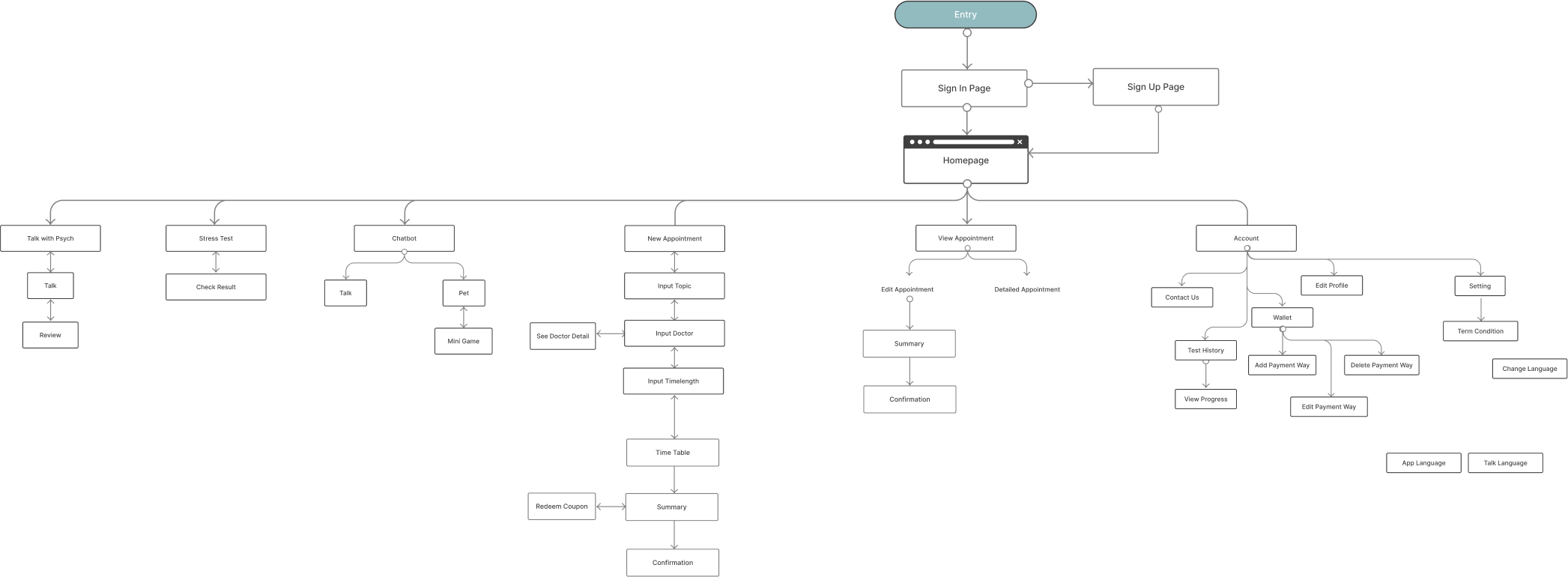
The IA and user flows were established when the first version was launched. I revise and expand a new user flow to help define the core and boundary of my concept when designing a new version.
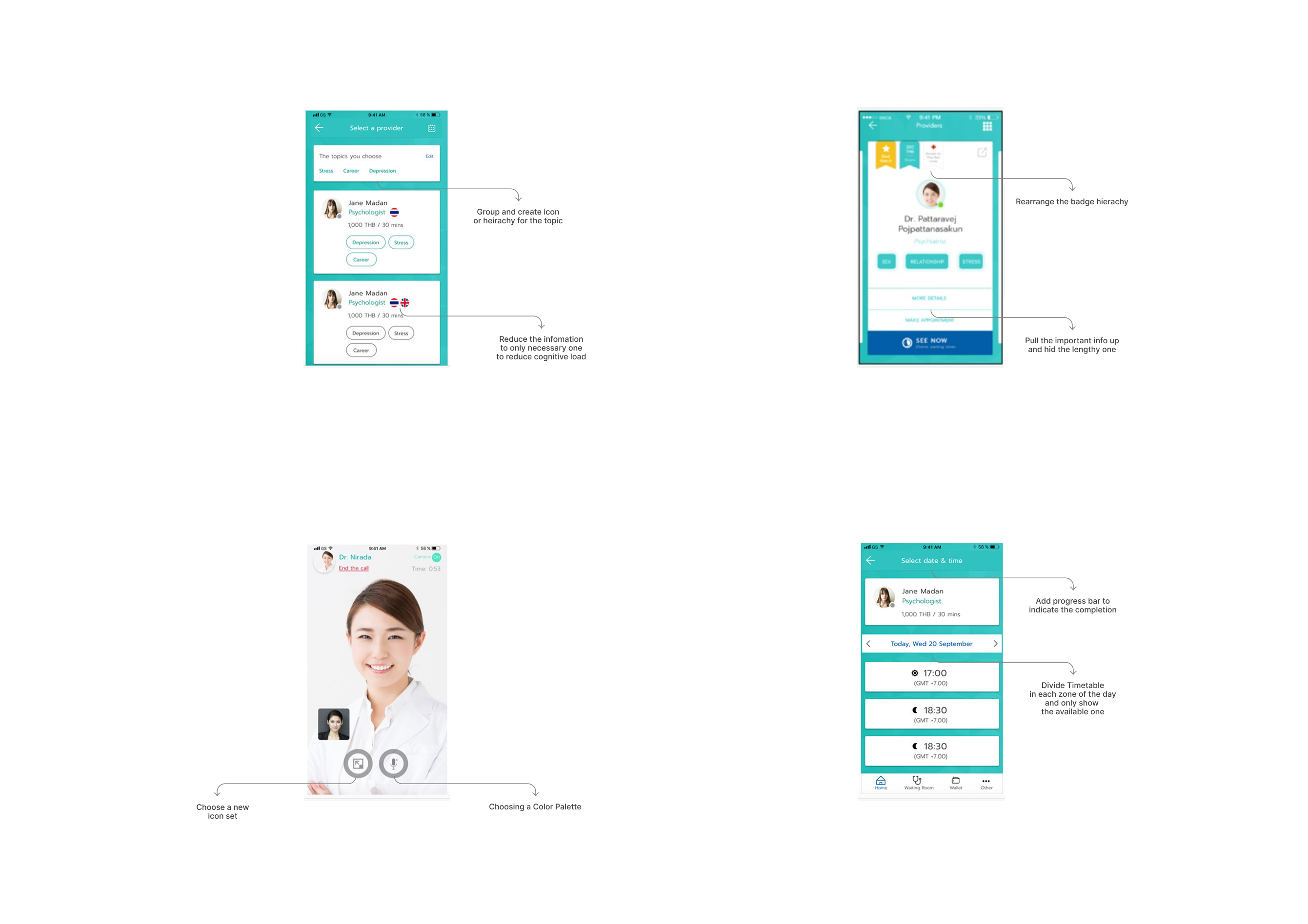
With a clear scope of the problems, I developed a new function and redesigned the process in the application to be inviting, friendly and easy to use though the following practices:
01
Arrange the process to decrease cognitive load
02
Increase engagement with users
03
Create safe and comfortable atmosphere for users.
To explore the problems and inconvenience of the users, I conduct an interview based on the target group of OOCA.

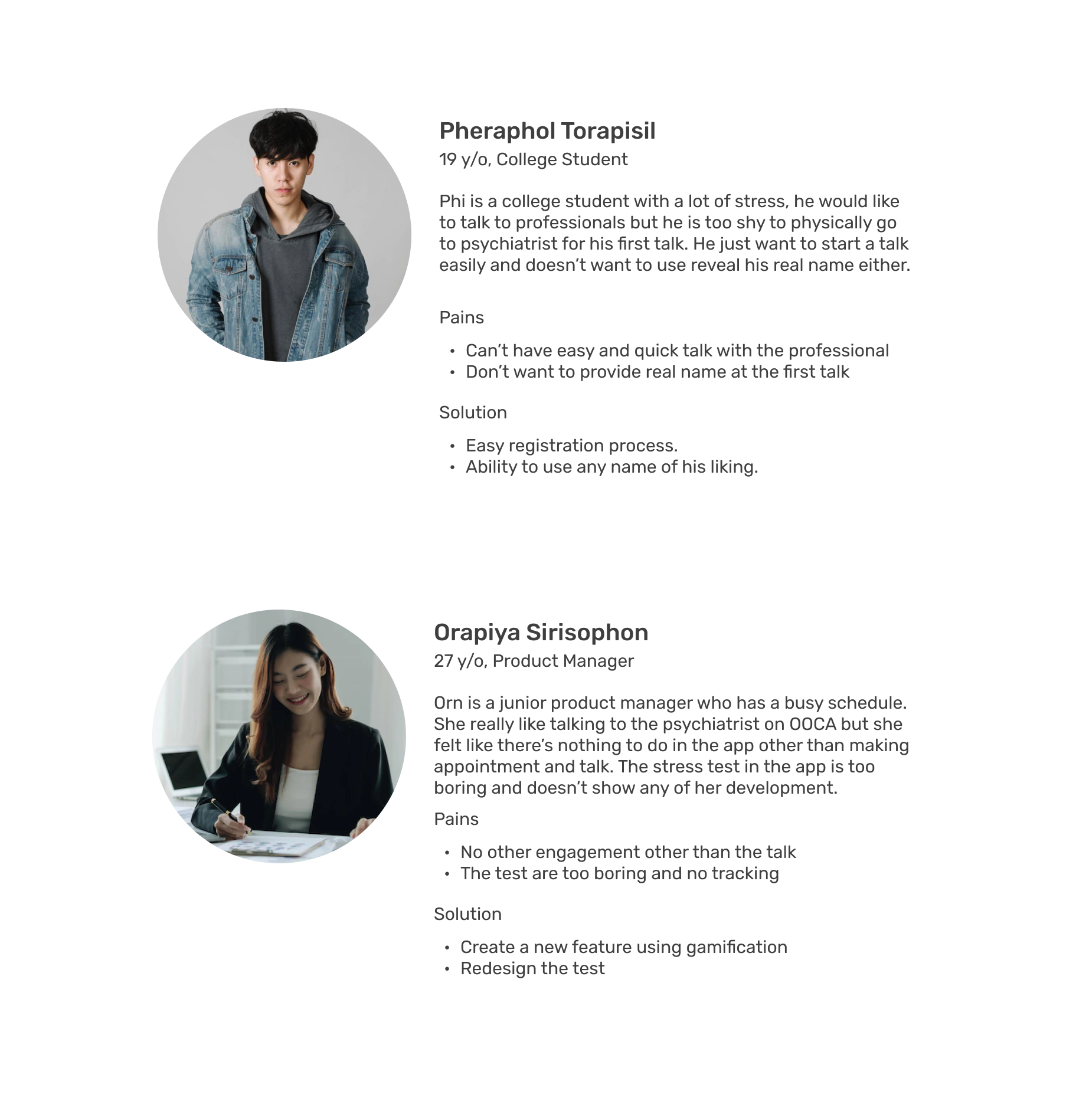
To understand the user and the problem more, I created a new persona based on the interview and research.
As a first step of design, I made digital wireframe in Figma to arrange the visual hierarchy and set the foundation for the next step.
Making the progress from the previous step, I created a lo-fi prototype for the usability test.

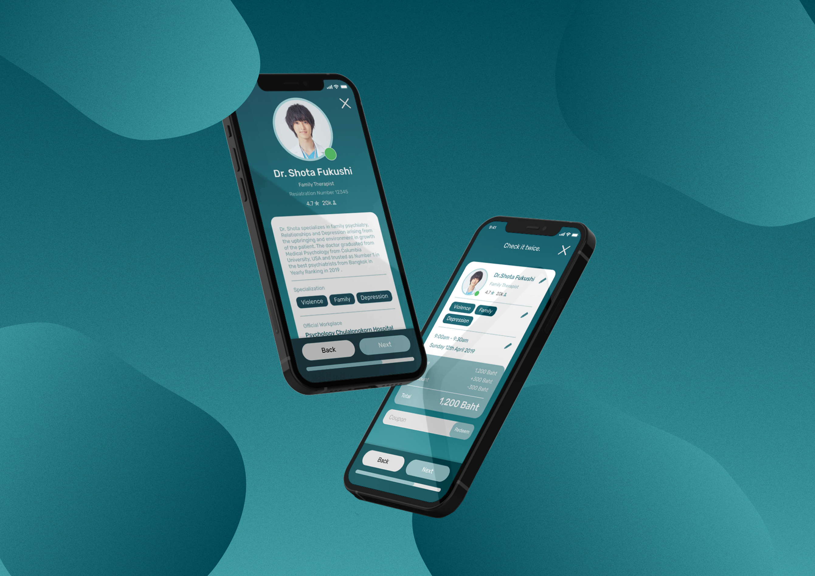
I have create the UI Design sample to demonstrate that the application could be given the dark color scheme to match with the time that users have the most engagement with the application.


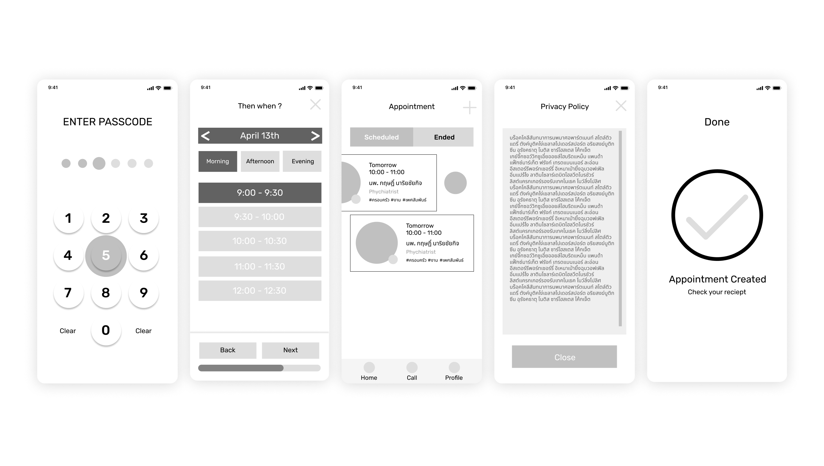
The experience design aims to reduce the friction typically experienced when using the application such as making appointments, talking with doctor, and doing the stress test.
Step by step process to reduce cognitive load and show the progress bar to help users know how much longer it would take to complete the process.
Providing an easy-to-understand set of questions to users together with a tracking system for them to help them acknowledge their improvement in both short and long term.
SImplified the process in the application.
Allowed user to track their mental health with the test both in short and long term.
Redesigned sign up process to be easier and to require fewer info in order to keep users' privacy.
Established new touchpoint for users to revisit application even there are no talk schedule.
Gives users more flexibility to create an appointment based on their references.

